
.jpg)
The May BLS job report looked strong on the surface, but large (and consistent) downward revisions to prior months suggest that the labor market is loosening up more than the Fed lets on. Also, the May CPI report turned out much better (that is, lower) than feared.
A recap of May “jobs week”
ADP: Almost no job growth in May. ADP reported that private employers added just 37,000 jobs in May — far below Wall Street expectations of around 120,000. Small companies (<50 employees) actually lost a net 13,000 jobs, and half of the industry categories tracked by ADP saw net job declines. [ADP]
BLS: Strong on the surface. In direct contrast to ADP’s data, the BLS jobs report showed that the US added a solid 139,000 jobs in May, with the unemployment rate steady at 4.2%. But wait…the prior two months’ numbers were revised down by 95,000 jobs! And the birth/death model — which is supposed to capture small business start-ups and failures — added nearly 200,000 jobs on a non-seasonally adjusted basis. [BLS]
TP: Real (ADP) vs. imputed (BLS). It’s getting to be a bit ridiculous. The birth-death model is adding imaginary jobs every month, and the initial BLS jobs numbers are typically revised down — twice!

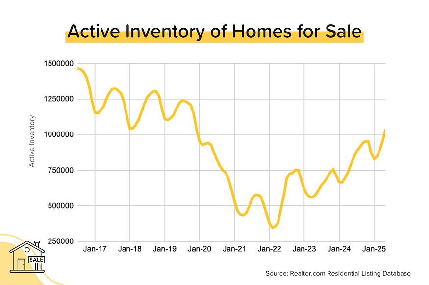
Home inventory levels continue to rise. The May update of Realtor.com’s Residential Listing Database showed that active inventory (which excludes homes already under contract) had risen 31.5% YoY to 1,036,101 units. The last time we had over 1 million homes for sale was December 2019 — just before the pandemic spurred a massive inventory drawdown. [Realtor.com]
TP: Back in December 2019, we had 1 million active listings and homes were selling at a 5.0–5.5 million unit annual pace. Today we’re back above 1 million active listings, but we’re selling homes at a 4.0 million unit annual pace.
Median listing prices trending lower. Let’s start with this: median listing prices aren’t the best way to look at home price appreciation. That’s because they can be skewed significantly by the changing mix of properties for sale. That said, it’s worth noting that in 60% of the Top 100 metros, median listing prices are down year-over-year. In most cities, however, these declines are modest (1–3%), especially when compared to the gains over the past 5 years. [Realtor.com]

May CPI was better (lower) than expected. Both the “headline” and “core” CPI (Consumer Price Index = inflation for you and me) rose by just 0.1% month-over-month, which meant that annual “core” inflation remained at +2.8% YoY. Wall Street expectations were for “headline” CPI to rise by 0.2% MoM and for “core” CPI to climb 0.3% MoM. Phew! [BLS]
TP: This was a surprisingly tame inflation report. Many of the larger categories (energy, new & used car prices) saw prices FALL month-over-month. If not for the 0.3% MoM (+3.9% YoY) increase in Shelter costs (which have an incredible 44% weighting in “core” CPI), the index could have gone backwards. And if you annualize the last 3 months of “core” CPI increases, you get 1.7% — well below the Fed’s 2% target. Like we asked last week, How Close is Close Enough?

Home insurance costs are a disaster. According to analysis from Zillow, average annual home insurance premiums have risen 38% since 2019, far outstripping the 22% rise in average annual household income over the same period. What’s happening? Two things: 1) a ~50% rise in home prices since 2019 (so higher repair/replacement costs), and 2) an increased incidence of catastrophic $1bn+ claim events (bigger underwriting losses for insurers). [Zillow]
TP: Home insurance used to be something a potential homebuyer never really thought about much. Downpayment, monthly mortgage bills, annual property tax — sure. But now both the availability and affordability of home insurance is a major concern.
Where Did All Those Jobs Go? (May 2025 Edition)
Last Friday, we got the important Bureau of Labor Statistics employment report. It showed that the US added 139,000 jobs in May — a bit higher than expectations — but the data for the previous two months was revised down by 95,000 jobs!
In fact, the initial jobs data almost always gets revised down — twice! The problem is that the bond market reacts immediately to the headline figure, but generally ignores the revisions. Why? Because people are too busy looking at the new month’s data to worry about the past!
As the table below shows, the number of jobs added in 2025 year-to-date has already been revised down by a total of 192,000 (that’s an average of 48,000 per month)!

And this certainly isn’t just a 2025 thing. In 2024, the monthly job additions were revised down by a total of 211,000 (~18,000 per month). And in 2023, the monthly job additions were revised down by a total of 360,000 (30,000 per month).
It really makes you wonder: would the Fed be so comfortable with interest rates this high if they could somehow see the revised jobs numbers first?
Where is All That Inventory?
I love diving into the latest monthly numbers from Realtor.com’s Residential Listing Database. In May 2025, total active inventory (which excludes homes under contract) rose 8.0% month-over-month (pretty normal for this time of year) and 31.5% year-over-year to 1,036,101 units. That’s the first time we’ve had more than a million homes for sale since December 2019. At the national level, active inventory is now just 12% below pre-pandemic levels.
But as I’ve noted previously, the inventory situation is VERY different from state to state. Broadly speaking, the South and West have inventory levels that are near or above pre-pandemic levels, while the Northeast and Midwest have inventory levels that are still well below pre-pandemic levels.
Inventory is also concentrated in a few states. Florida and Texas alone represent 30% of the total active inventory in the country, despite only having 15% of the population. And both states’ inventory levels are ~30% above May 2019 levels. (Note: In May 2019, Florida and Texas had just 20% of the total active inventory in the country).

It’s a totally different situation for New York State and Pennsylvania, where inventory levels are still ~43% below pre-pandemic levels.

Inventory Levels for the Seven Largest States by Population

In fact, there are currently 10 states with inventory levels (May 2025) that are ABOVE pre-pandemic levels (May 2019). You’ll notice that the majority of these states are in the South or the mountain West. You may also recall that most of these states benefited heavily from pandemic-era migration trends AND saw huge home price movements.
10 States with Inventory Levels (May 2025) ABOVE Pre-Pandemic Levels (May 2019)
Colorado: +34.5%
Texas: +32.5%
Florida: +26.3%
Washington: +25.8%
Tennessee: +25.3%
Arizona: +24.3%
Idaho: +21.8%
Utah: +18.8%
Hawaii: +8.4%
Oregon: +4.1%
So are home price trends reflecting the supply situation in these states? In general, yes. There are currently 20 states where median listing prices are DOWN year-over-year, and the majority of those were also in the list above (had inventory above pre-pandemic levels).
States where Median Listing Prices are Falling YoY (May 2024 vs. May 2019)
Kansas: -7.7% YoY
Hawaii: -6.7% YoY
Iowa: -5.4% YoY
Illinois: -4.8% YoY
Minnesota: -3.6% YoY
Arizona: -3.6% YoY
Utah: -3.4% YoY
Colorado: -3.0% YoY
Massachusetts: -2.9% YoY
Florida: -2.2% YoY
Not shown: CT, TN, DE, MT, CA, OH, TX, NJ, MS, ID (all down by 2% or less)
It’s important to note a few things about the data above. First, we’re looking at median listing prices, which can easily be skewed by the “mix” of properties available. Second, you can’t look at supply in isolation; many of these states saw an influx of new residents, and that means higher demand. Third, we’re only looking at existing homes; and many of the states with inventory levels above pre-pandemic levels ALSO saw an apartment and home building boom.
OK, So Where are Home Prices Falling?
The Realtor.com data also looks at the median listing price on a monthly basis. I was curious which cities were seeing the largest declines. Remember: the listing price can be seriously skewed by the mix of properties on sale from month to month — so this is a far-from-perfect measure of appreciation or depreciation. Still, here’s what I found:
- Of the Top 100 cities by household size, 61 (61%) saw year-over-year declines in their median listing prices in April 2025. (This figure was 48 last month). But most of those YoY declines were small (1–3%).
- The biggest decreases among the Top 100 were: Bridgeport CT (-13% YoY), Wichita KS (-11%), Durham-Chapel Hill NC (-10%), Oxnard-Thousand Oaks-Ventura CA (-9%), and Urban Honolulu HI (-9% YoY).
- The largest increases among the Top 100 were: Baltimore MD (+10% YoY), Augusta-Richmond GA/SC (+8% YoY), Toledo OH (+14% YoY), New Haven CT (+7% YoY), and Syracuse NY (+6%).
- Taking a look at the next 100 (101–200), 63 metros (61%) saw YoY declines in their median listing price. In other words, the trends we’re seeing in the Top 100 extend much deeper.
We’ve got to be careful here, because more accurate measures of home price appreciation (Case-Shiller, FHFA etc.) are saying that home prices are still trending up in all the bigger cities except Tampa. And even Tampa is only down slightly after rising by ~70% over the previous 5 years.
Mortgage Market
Initially, the bond market took the May BLS jobs numbers pretty badly. But as economists and investors dissected the report, it became clear that this was a weaker job report than it appeared at first glance. We were also braced for a bad May CPI report, which was expected to show a reacceleration in annual inflation. Instead, both the “headline” and “core” indexes were pretty much flat (and could have gone backwards if not for Shelter costs).
Add this all together and US treasury yields and average 30-year mortgage rates were little changed. The mortgage market just can’t seem to shake 7%.
Here’s what the Fed Funds Rate futures market is currently pricing in for rate cuts. Note that the current Fed Funds Rate policy range is 4.25–4.50%.
- June 18 FOMC Meeting: 100% probability that the policy rate will remain at 4.25–4.50% (no rate cut). This was 99% last week.
- July 30 FOMC Meeting: 83% probability that the policy rate will remain at 4.25–4.50% (up from 70% last week). 17% probability that rates will be 25 bps below current (down from 29% last week). This implies one 25 bps rate cut at this meeting
- September 17 FOMC Meeting: 57% probability that rates will be 25 bps below current (unchanged from last week). This implies one 25 bps rate cut on either July 30 or Sept 17, but not both. 10% probability that rates will be 50 bps below current (implying a 25 bps rate cut at both the July 30 and Sept 17 meetings).

Related posts

Barry Habib Joins Fannie Mae Board of Directors


Home Sales Stay Sluggish in June
.jpg)
Weekend Talking Points - 'Pausitive'
Ready to close more deals?
ListReports automatically delivers personalized marketing collateral to your inbox helping you engage with your customers and prospects.